tailored magazine
Editorial project
Featured Project
TAILORED MAGAZINE:
Editorial project
The task for this project was formulated in a following brief:
“The rise of the digital press has seen a tremendous peak over the last few years. The audience is increasing as Millennials grow older, demanding all sorts of content.
The best magazines and newspapers had already launched their digital version in early 2000, but it has been only in the last 5 years that the digital experience started to take its own shape.
With numbers increasing, publishers are prompted to deliver quality content along with a great digital product for readers to experience a different but still unique act of opening up a magazine and dive into it.”
The goal here is to design a responsive online platform for a magazine, newspaper or blog directed to meet the needs and goals of one of the presented User Personas.
For me personally it was the hardest task from all of the featured projects, be cause of the user persona being so different from me, my views and lifestyle. I would say that the first two days of kicking off the project I have immersed myself into the informational surrounding of the user persona given, conducting surveys and doing my best to understand the motives and interest of the user.
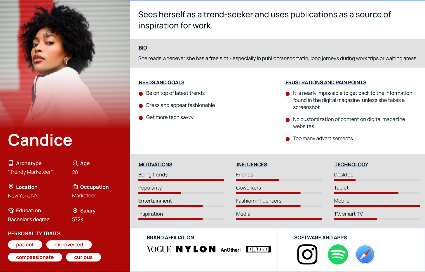
Given user is a trendy marketeer Candice, whose’s user persona is depicted below.
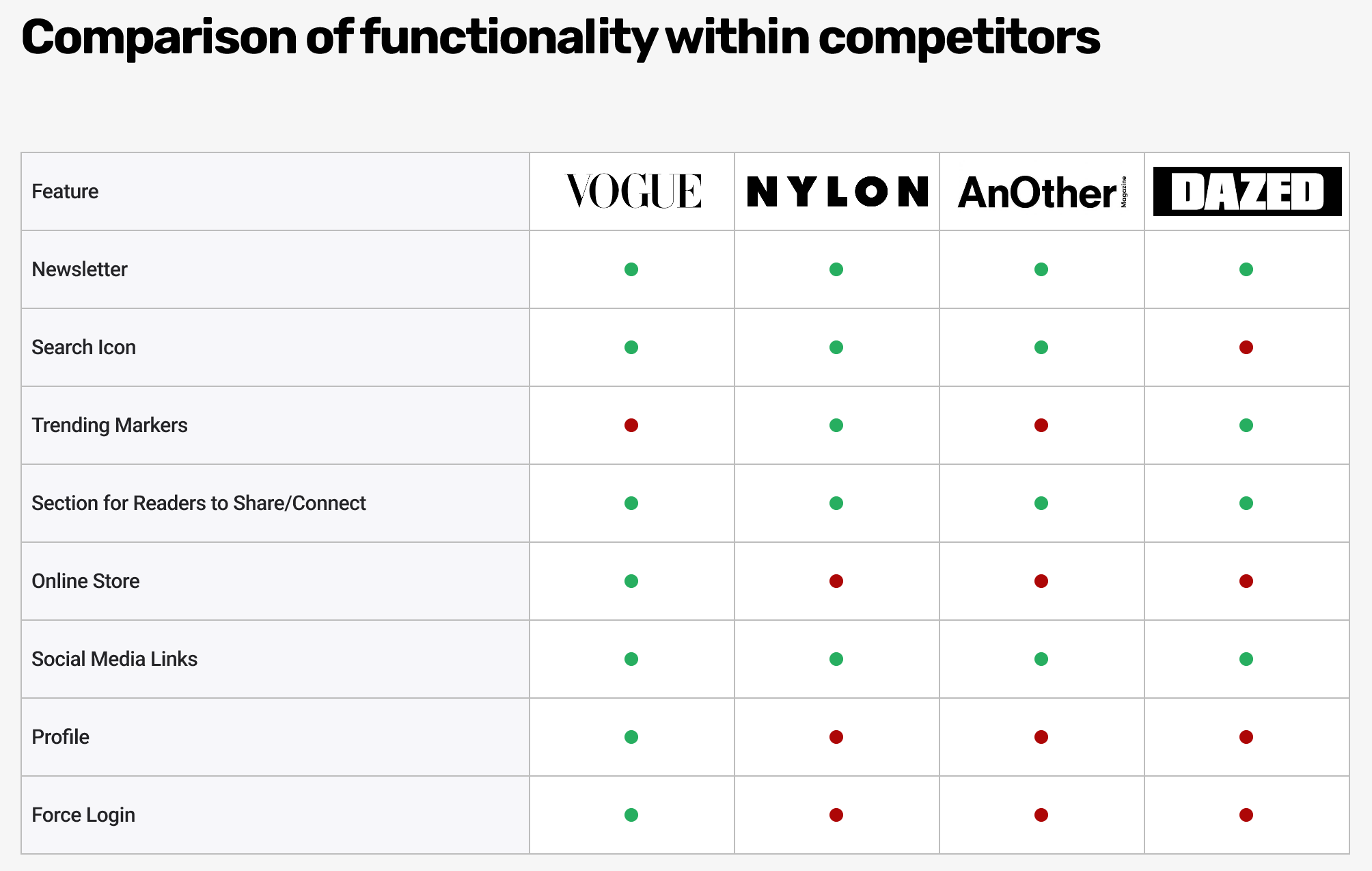
I browsed the magazines that our user persona is associated with, studied the colors, design and marketing packages they publish for the advertisers. We compared functionality of the given websites and created comparative analysis chart.
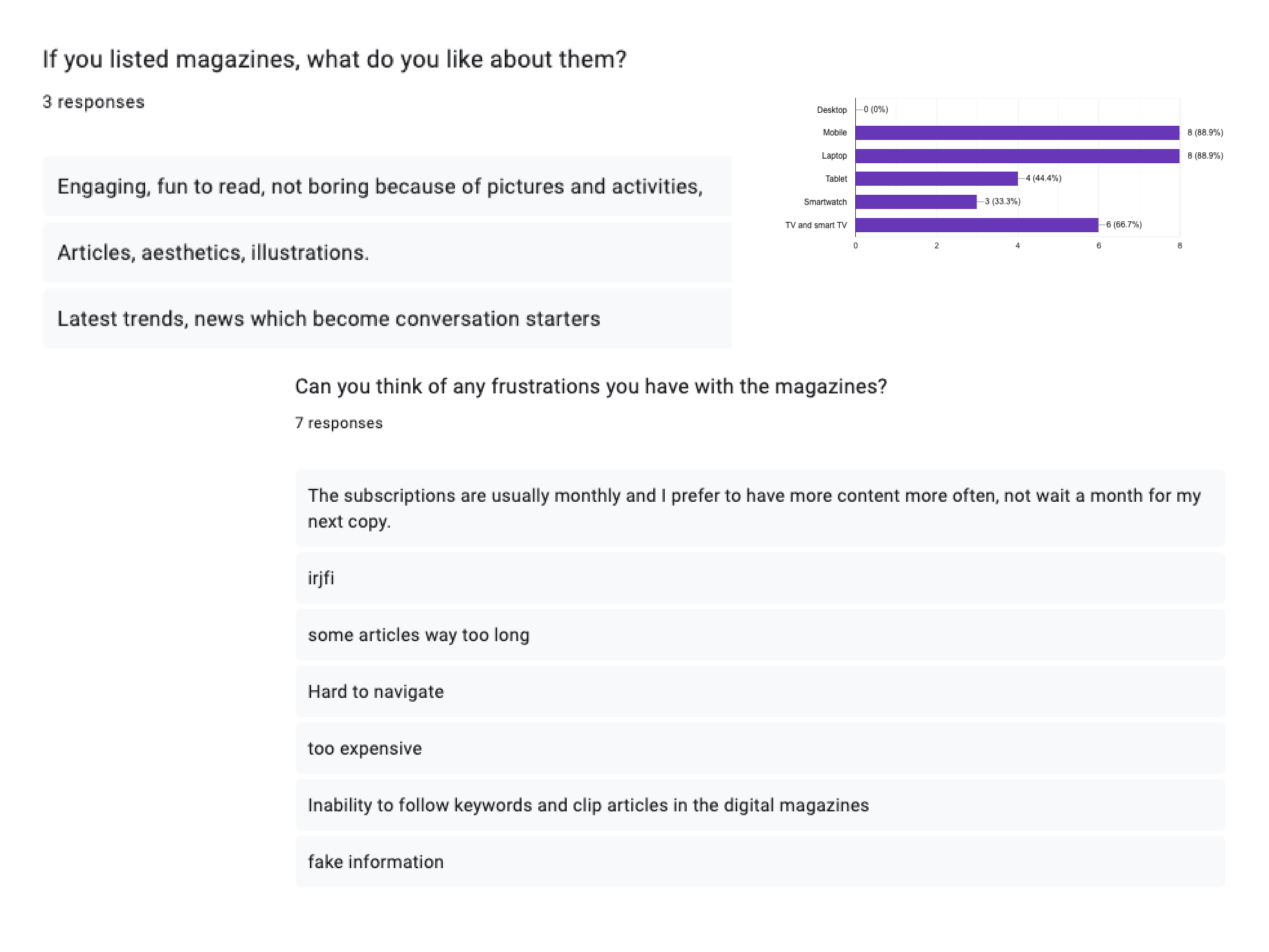
We created a questionnaire to find out what needs the users have, that might be unmet with the current competition.
- Here are some results, that I believe deserve the most attention. The biggest pain point was that the magazines are over-cluttered with the advertising materials, either obvious ads or articles written to convert user to buy product. The magazines are getting expensive or push narratives of whoever orders the article to be written.
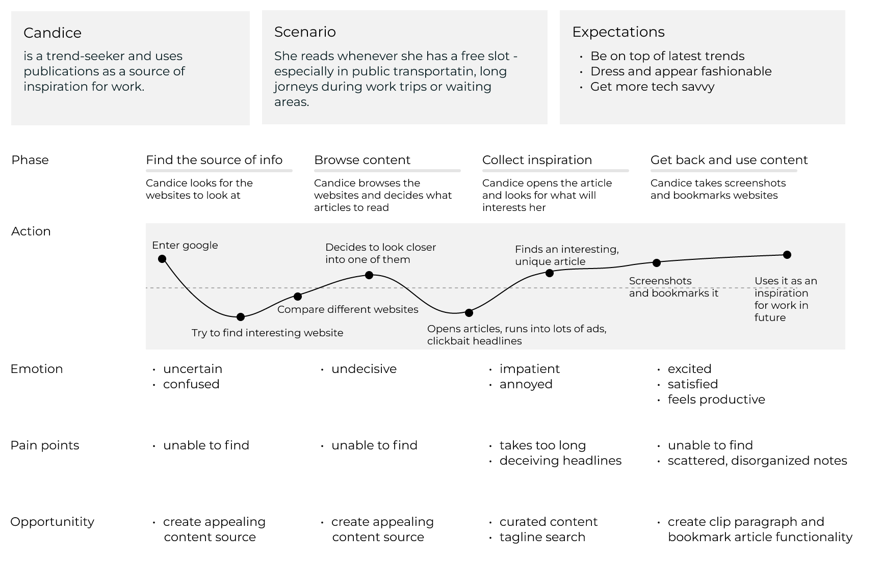
Here’s what Candice’s journey map looks like. She struggles finding an interesting online magazine because all of them are very distracting and have little relevant information to her needs. There are way to many deceiving clickbait headlines, and the content is not customizable, unlike the social media that constantly competes for user’s attention.
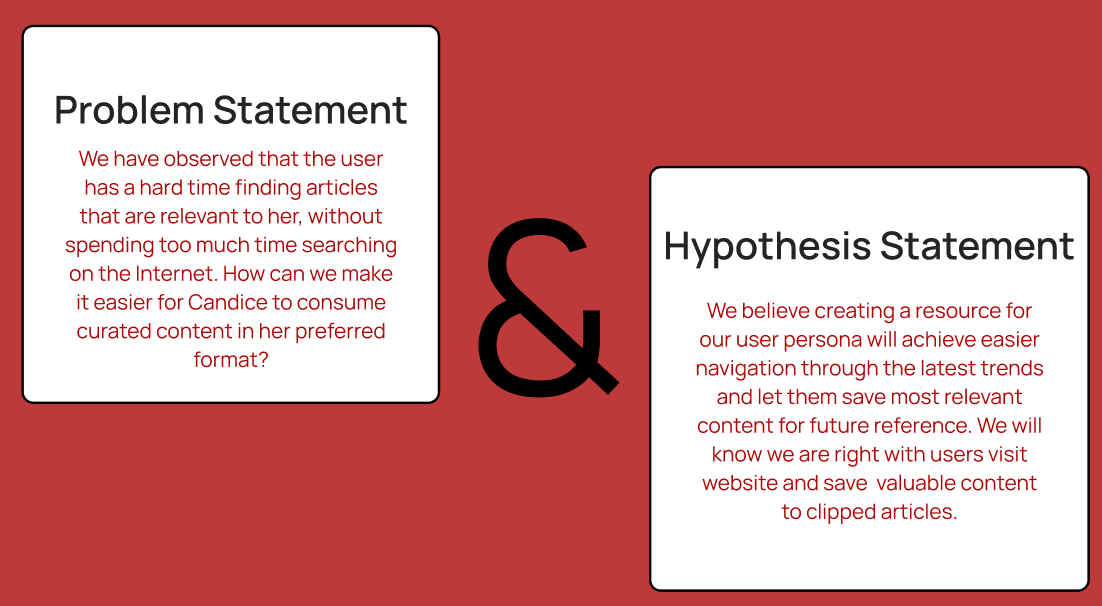
We have observed that the user has a hard time finding articles that are relevant to her, without spending too much time searching on the Internet.
How can we make it easier for Candice to consume curated content in her preferred format?
We believe creating a resource for our user persona will achieve easier navigation through the latest trends and let them save most relevant content for future reference. We will know we are right with users visit website and save valuable content to clipped articles, and the saved content will help the website’s algorithm further curate the content that will be interesting and engaging to our user.
- Hence, the name “Tailored Magazine” emerged, as the content is being ‘tailored” to whoever uses it.
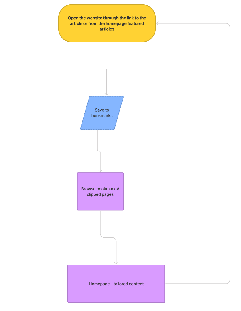
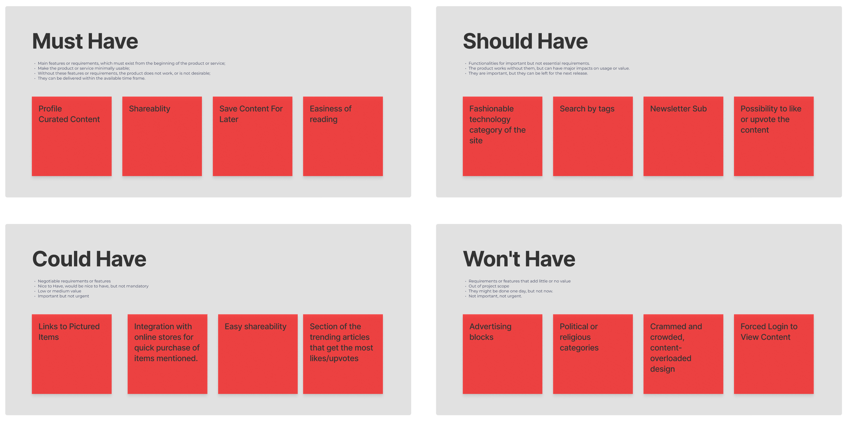
After aggregating all the data in blocks, we created a SWOT table. Based on it, we proceeded to the Lo-fi’s.
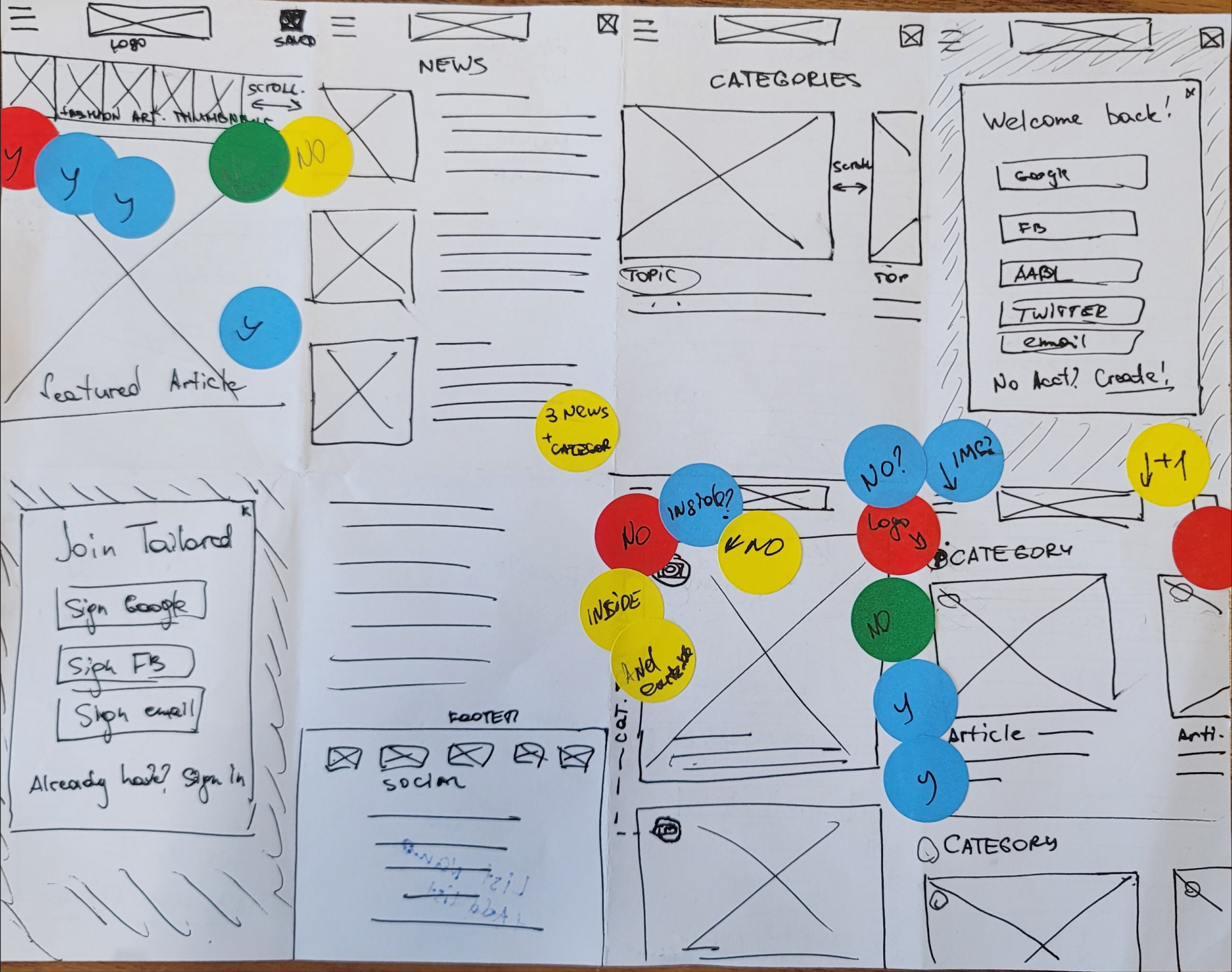
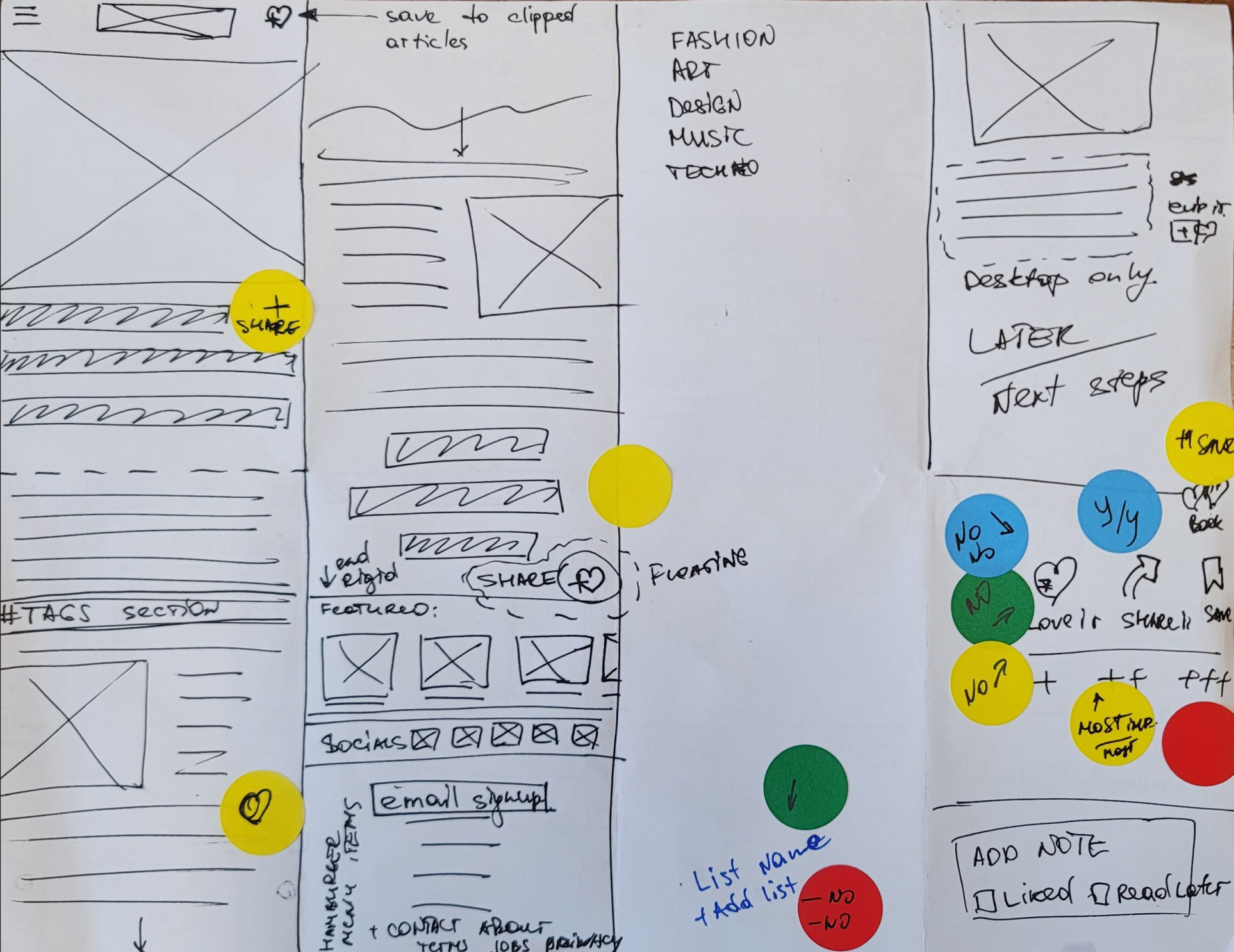
We performed testing of our Lo-Fi’s and found the following:
- 4/5 Testers would not use the like button and don’t understand how different it is from saving
- 2 testers would not like to see icons over images
- 4 testers said they would save articles to their list
- 2 testers would use sharing feature without even reading the article
- Based on this data, we decided to discard the Like button altogether and proceeded to Mid-Fi designs. The majority of users are using mobile phones as their primary devices, so we developed the design mobile-first.
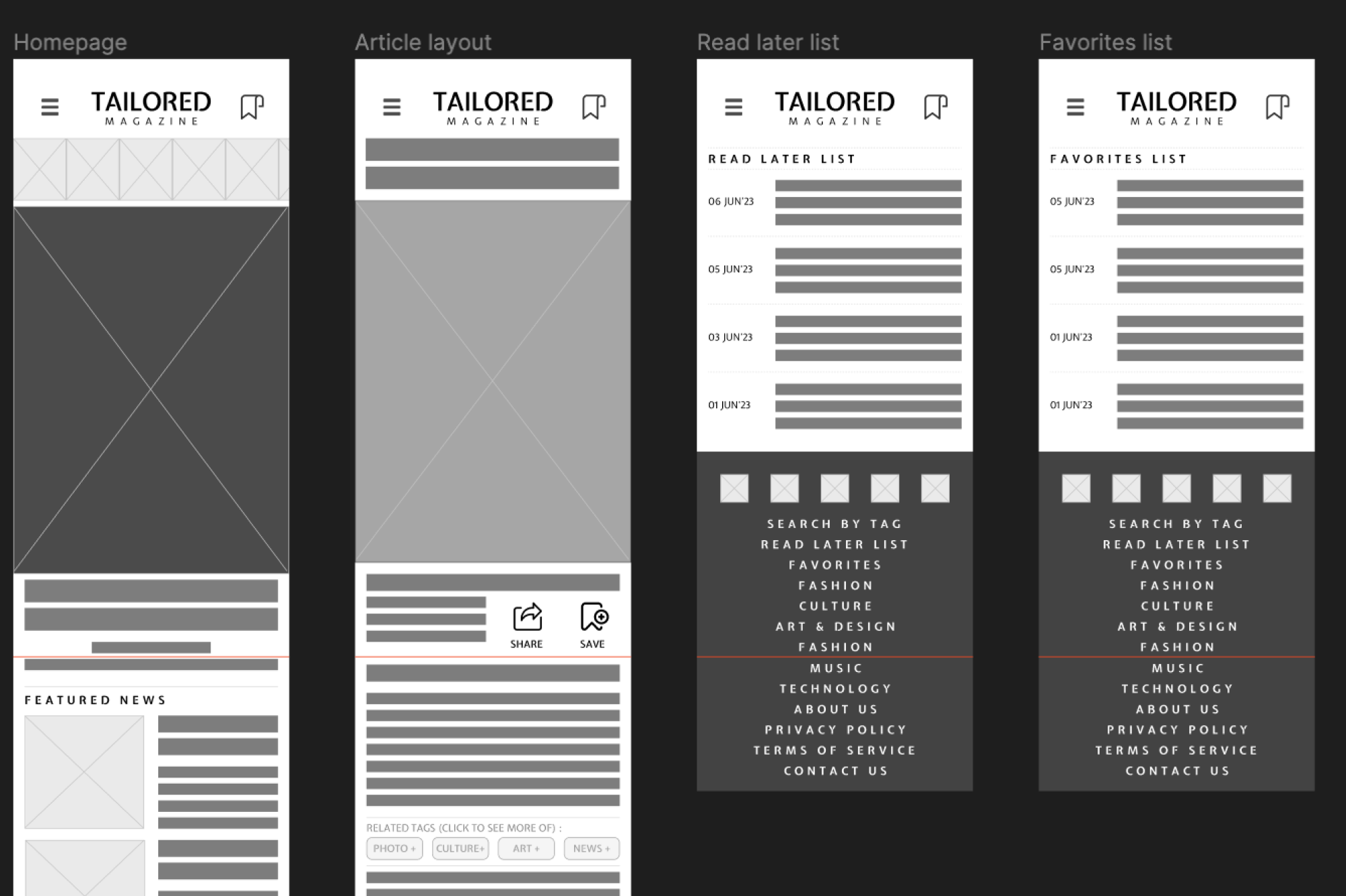
Testing the Mid-Fi gave us 100% Completion Rate with 5 testers.
Feedback received on the design was as follows:
- ‘Clean, Modern, Accessible”
- “Cool, Cool, Cool”
- “Save and favorites buttons look the same, which is confusing”.
From here we draw our conclusions and proceeded to designing and testing our moodboard.
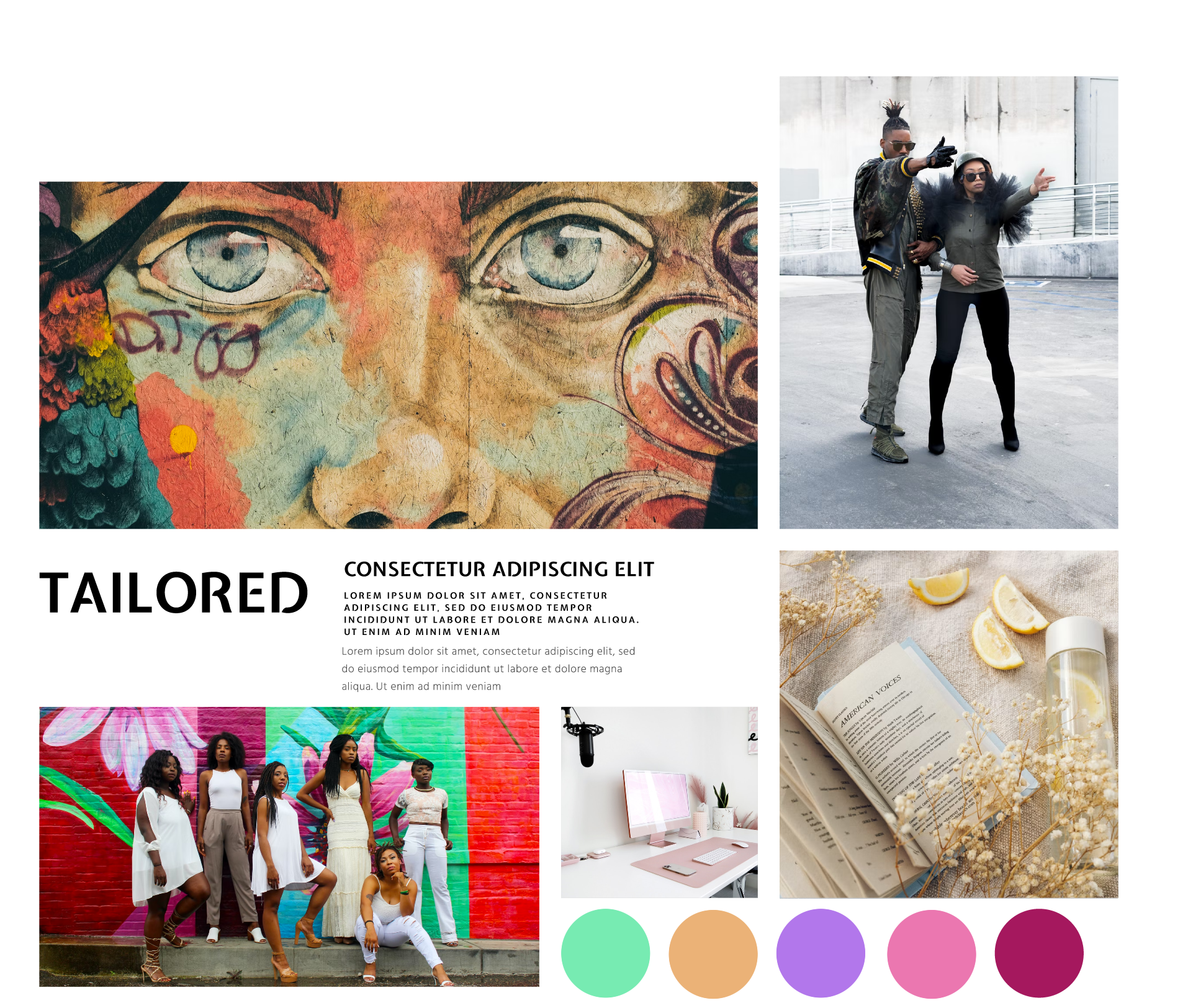

Getting the desired feedback from the moodboard, we proceeded to designing the Hi-Fi’s.
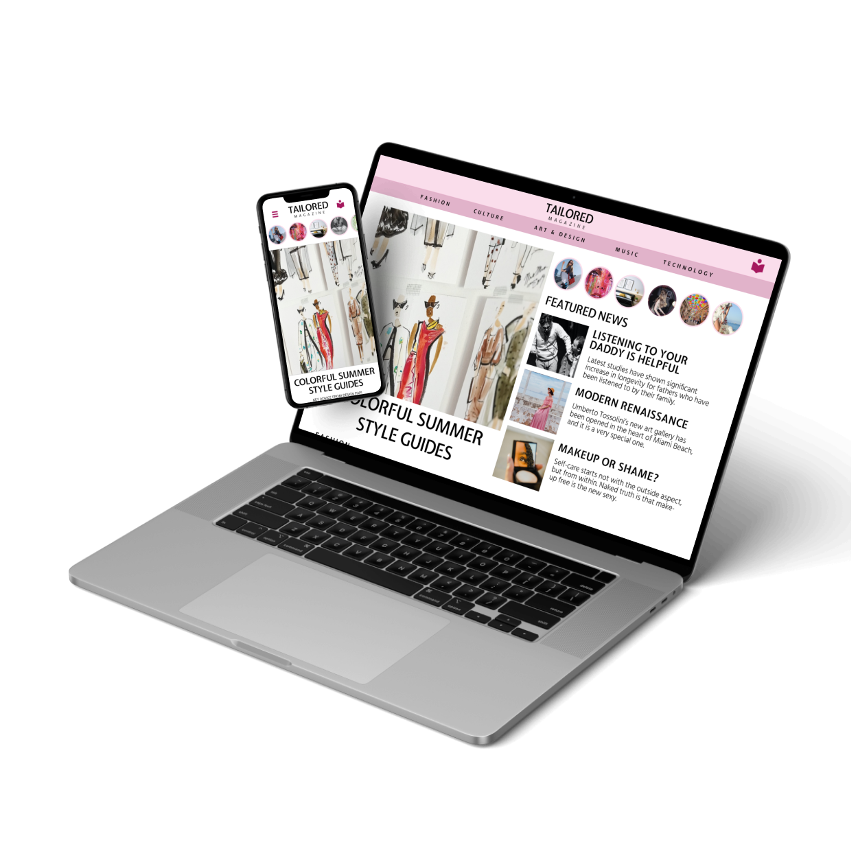
The mobile design features the random article section, that would be tailored to user’s profile. The main section of the site has categories with articles scrolling horisontally. The user can save articles to favorites once he opens articles.
Below you can see the layouts for mobile and desktop compared side-by side.
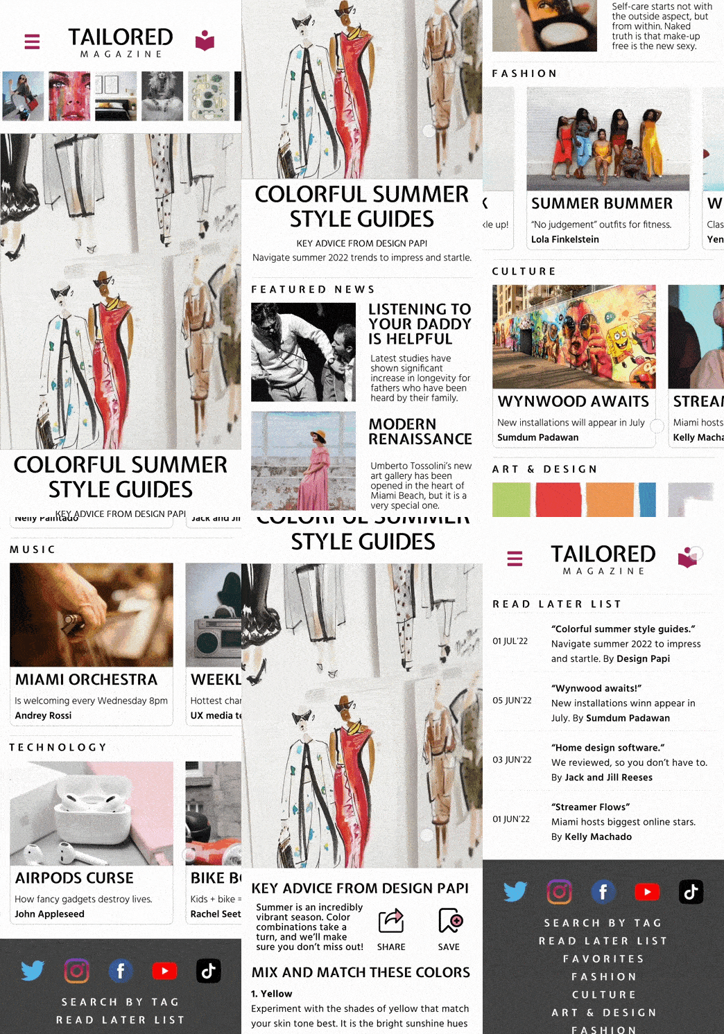

Testing the Hi-Fi’s showed, that users did not fully understand the functionality of the random article section in the top of the digital magazine. It was suggested, that making images round instead of rectangle-shaped, would hint that it is a featured story.
This feedback helped us re-iterate and improve design. You can use the Figma prototype by following this link.


